
Last year, KnowObstacles collaborated with a talented young designer, Wil Barker, on the first of our ‘Featured Artist’ series of T-Shirts. Recently, he’s been hard at the grindstone working on new stuff, but we managed to grab a few minutes out of his schedule to get a little insight into the design process.
So Wil, we worked with you last year to see your take on the Know Obstacles/WFPF brand, what were your initial thoughts on the project?

Wil Barker of Youseven
My very first thoughts were “Wow, they know who I am”, I was really surprised, but when you think about it our community is so vastly connected, everyone seems to know everyone and my work must have found its way to KO through someone that way. With the project I was really excited to work with KO as I know they can create a quality product with thought gone into it unlike a lot of parkour clothing brands.
How did you find working and building upon the existing designs?
I didn’t find it too difficult, my work tends to be on the minimalistic side and typography focused and that gives it something in common with a lot of the KO designs and meant I could take advantage of the some of the elements such as the jumper icon.
What were your influences with your designs?
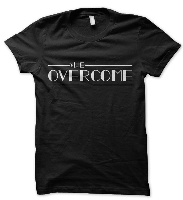
My designs were influenced by my art style, the existing KO designs as well as older art styles such as through the art deco-esque lettering for “We Overcome” and vintage collegiate style lettering for “Vintage Athletic”.
The ‘Jump’ ambigram you created is unlike anything else we had ever seen in the parkour clothing space, how did you come up with it?
Thanks, I don’t really remember why but for some reason I decided I wanted to created a design just saying “jump” and when sketching it I noticed the similarities between the lettering structure in the two halves of the word. Because I had looked into ambigrams before after seeing them around I had a good idea of how to put one together, I then settled on a sharper style to the lettering as I thought it would make the design more modern & reflective of Parkour and digitalized it. Few months after that I got a batch of tees made with it on just for fun and to share with friends, but it became much more than that.
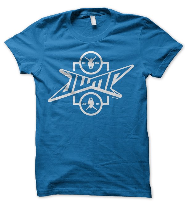 Click to visit the store page
What’s the process like with creating an ambigram?
I think it’s best to start by deciding on the word or words you want to use. I then begin to sketch on paper or in my mind the ambigram starting from the middle of the word(s) then working my way out. If you’re only making one word you will only need to make the first half of it as the second half will be the first half rotated 180°. I then chose to digitalize my design in Adobe Illustrator using the pen tool as I can then scale it up without losing quality, after that I copy, paste and rotate the original half 180° before joining them together to create the full ambigram. Finally I like to add some artist embellishment to the design such as flourishes for other elements to add more context, interest and appeal.
Which is your favourite shirt of the selection?
My favourite design of the selection has to be the “Vintage Athletic” design in burgundy. It’s a great colourway and the design is a nice take on that style of typographic design. Out of all of KO’s designs my favourite has to the limited edition original “All the world’s a playground” tee which is no longer available, I just love how clean the design was and how it didn’t look like your standard parkour tee.
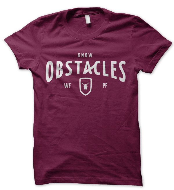
What was the most challenging design to work on?
I think the most challenging design to work on was the “Vintage Athletic” tee just because I had to come up with a unique approach to a style of design that has been around for a long time. With the unconventional ligature in the type and the other elements such as the jumper badge and WFPF I think it works well.
You’ve become quite well known in the community as a quality designer to work with, can you give some examples of other parkour stuff you worked on?
Yeah, I’ve been described as “on a quest for world domination” as my designs seem to be appearing everywhere. I designed Storm Freerun’s new website which was then built by a friend of mine Elliot Greenwood. I did Prime LA’s branding & tees as well as tees for Airborn, KO, Tempest Pro Takeover and Train Hard Parkour. I’ve got more to announce and probably some more I’ve done too, but I can’t remember.
What is your goal for the future, do you want to stay in design?
Definitely! Unless things go horribly wrong I’m off to university to study Graphic & Media Design for 3 years in late September, after that the plan is to get a job as a Graphic Designer in a design studio or even create my own studio. Either way I’ll still be designing, training and making things for years to come. I don’t plan on stopping any time soon.
Do you have any advice for anyone looking to turn their creative talent into a career?
Start now, work hard, work even harder, don’t worry about the money straight away (it’ll come), don’t give up, do more of what you love, have fun and be happy.
We’re looking forward to seeing what Wil comes up with next. You can see some of his other work at his personal portfolio. Liked any of the shirts above? We have these, plus alternate colour-schemes at the KnowObstacles Featured Artist store!